Replace confusion
with confidence.
Identity evolution, visual, voice, and illustration guides. Strategy to migrate a desktop experience to mobile platform.
Identity evolution, visual, voice, and illustration guides. Strategy to migrate a desktop experience to mobile platform.
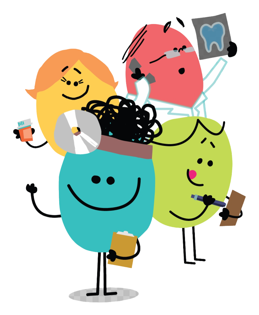
ALEX walks employees through benefits enrollment one-on-one. An HR department purchases the platform, loads their company's benefits data, and employees get a guided conversation that surfaces only what's relevant to them.
Two audiences: the HR director evaluating a vendor, and the employee who opens it once a year and has twenty minutes to pick a health plan.
The personality is the product. Jellyvision built ALEX on the premise that humor keeps people engaged with complex information long enough for it to land.
We use humor to talk about confusing benefits stuff because humor gets results. Over and over, it's been proven to keep people more engaged, improve comprehension of complex information, and help people retain more, longer.
Jellyvision — on the ALEX product philosophy
There was a strong starting point. The opportunity was to build out a more complete system: full logo standards, a thorough color palette, typographic hierarchy across product and marketing, and illustration rules any designer could pick up and replicate.
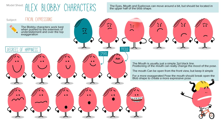
The illustration system was built to be light enough for any illustrator to work in. Blob forms with minimal line work, consistent expressions and props, color fills from the brand palette. External illustrators could pick it up with little more than the style guide.
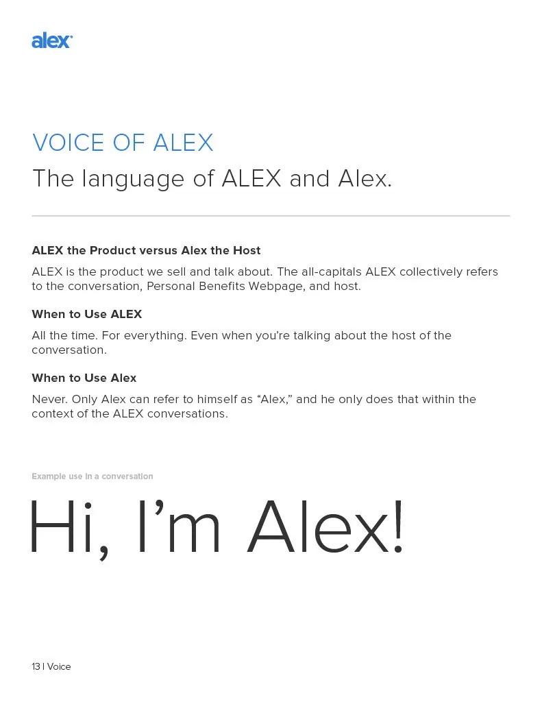
Copy had always been ALEX's most consistent asset. Jellyvision took tone seriously — voice rules, style guidelines, specific instructions about when to use ALEX versus Alex and why. When the design system was still being built out across touchpoints, the copy held the brand together.
Building the visual system around that voice made the brand feel like one product across every touchpoint. It also made the technical migration much less disruptive than it could have been. When the video format changed, the writing stayed the same. That was enough.

The original product was built as video modules. A host walked employees through their benefits on screen, one question at a time. When mobile became a requirement, video wasn't the answer it had been on desktop. Several directions were tried: GIFs, embedded players, iframes. Most of them technically worked. None of them felt right.
What landed was simpler: static screens, consistent type and color, and the same voice. Buttons instead of video. The brand system was already tight enough that the format change didn't register as a downgrade.
The visual system rolled out across sales collateral, marketing materials, and customer, partner, and client-facing products. Illustration standards built for any designer to work from. Better collaboration between design, UX, engineering, and implementation teams.
98%
of surveyed employees found the medical insurance module helpful
88%
of surveyed employees say they understand their benefits better
95%
found the HSA tax savings explanation helpful
30%
increase in FSA participation
"When we were using PowerPoint to explain everything, employees' eyes would just glaze over. Now, with ALEX, keeping our employees engaged about their benefits during and after orientation is much easier."
Susan Hoover, Executive Director of Human Resources, AdventHealth
"I really like how ALEX gives me a better understanding on what benefits to choose. It's on a more simple level versus reading the benefits and missing something."
Employee, AdventHealth Orlando