Leveraging AI as My Executive Intern
A lot of this project lived in a chat window. Not to generate ideas, but to do the time-consuming groundwork that would otherwise eat a week before a single mark got made.
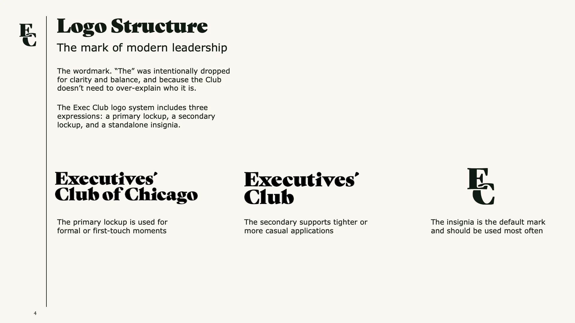
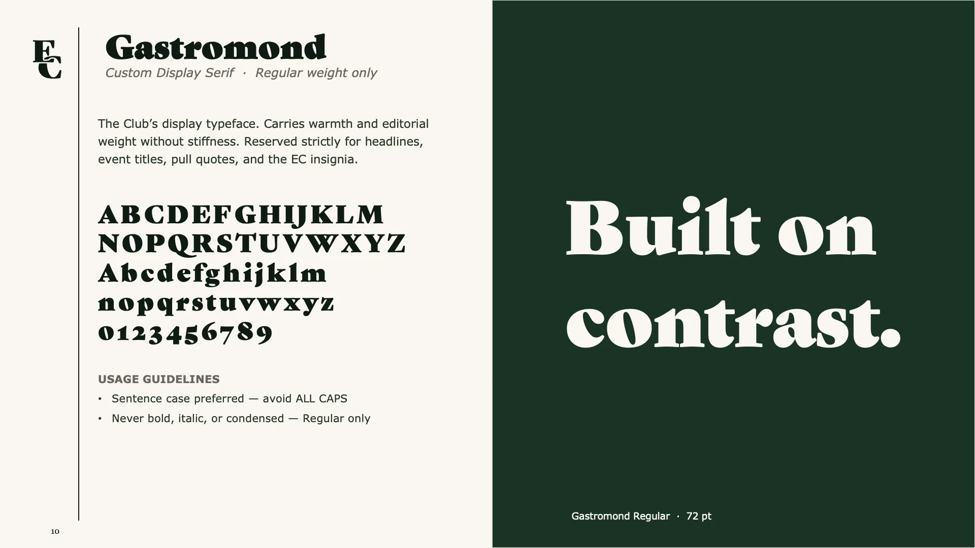
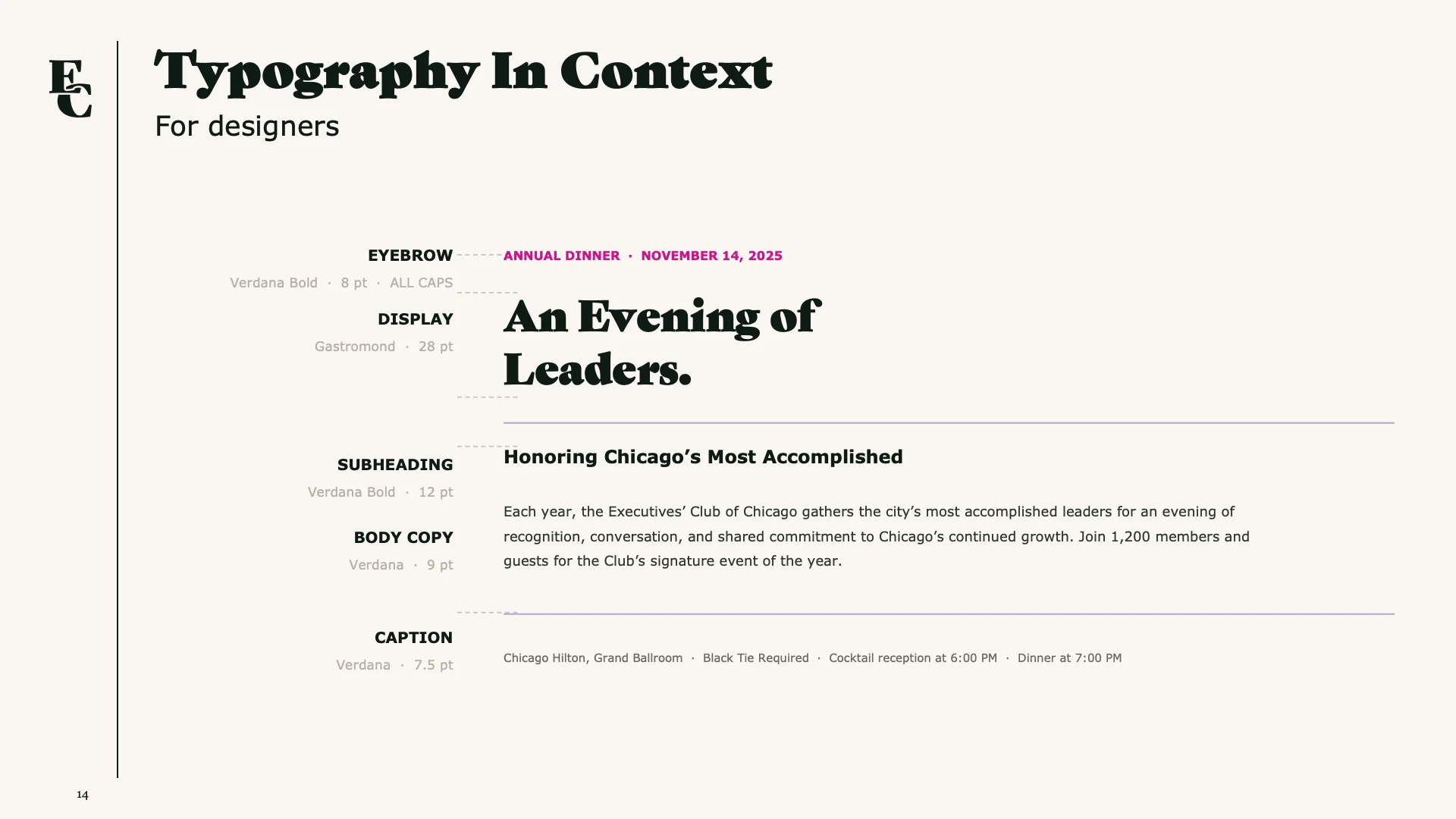
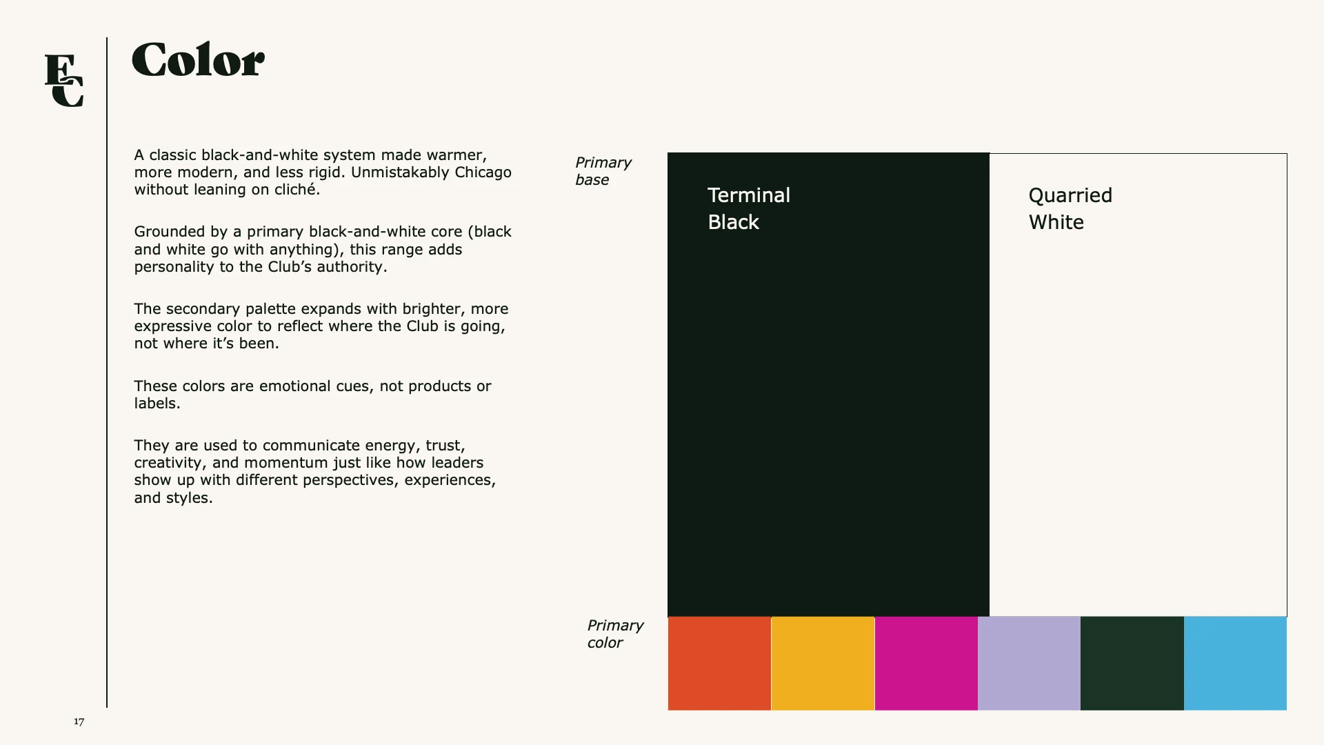
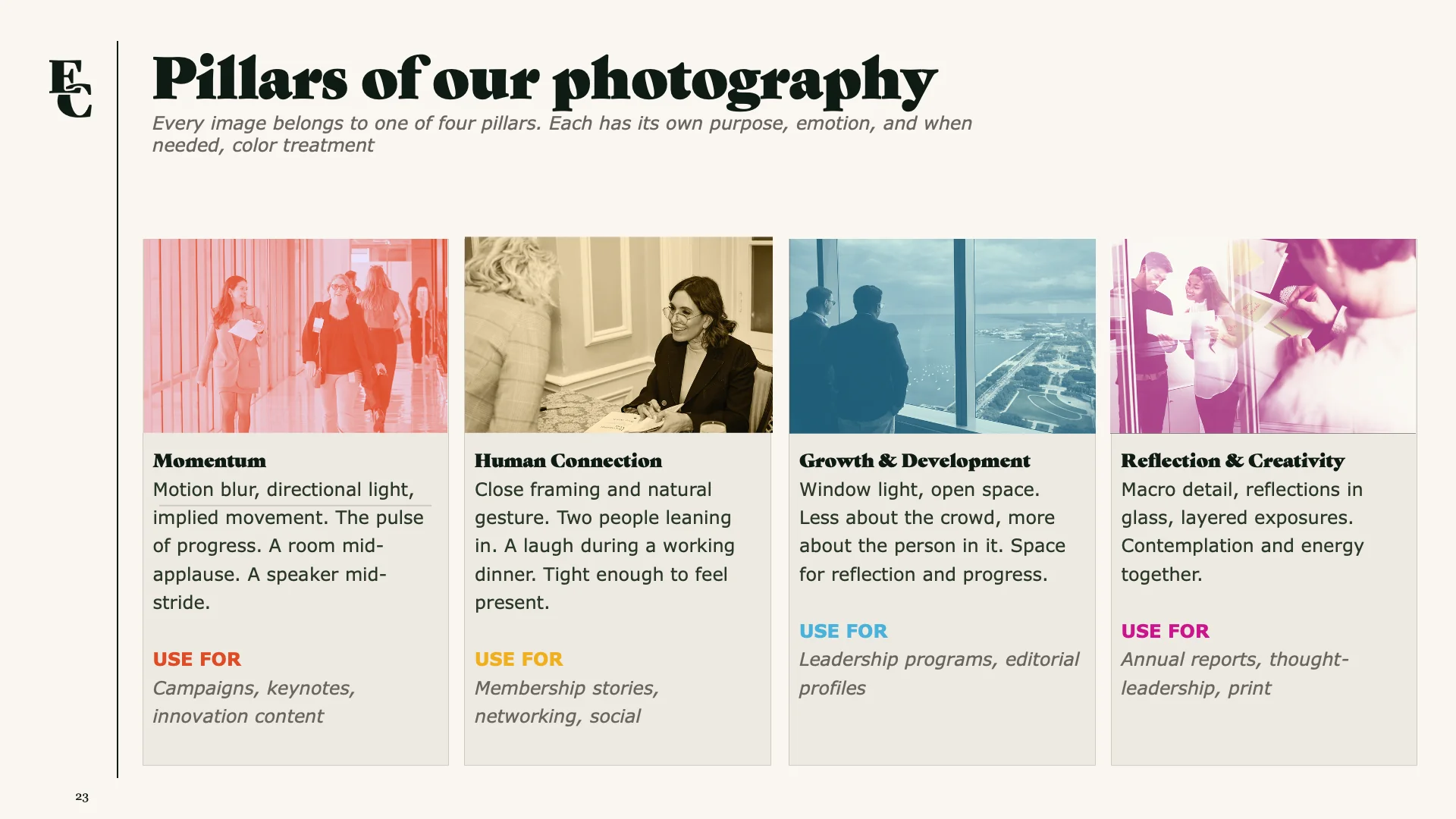
Sample Prompts
Audit the current brand across all touchpoints.
Research the legacy identity — what did this organization look like before it became EXEC CLUB?
Find competitors in the Chicago leadership org space. Map them by age, formality, and perceived accessibility.
Pull inspiration that feels like 1980s Wall Street meets 1990s editorial design. Think New York Magazine layouts, early Wired, old Forbes covers. Confidence that doesn't need to explain itself.
Tell me what the current brand is saying to two very different people: a CEO who's been a member for 20 years, and a recent grad who just got promoted for the first time.
Current brand: the EXEC CLUB mark reads efficient but institutional. The abbreviated wordmark with a yellow X signals precision over warmth — more directory than destination. Legacy review shows the organization carried significantly more editorial weight in earlier decades; the current mark abandoned that entirely.
Competitive landscape: 12 Chicago-area leadership organizations mapped. Most cluster around formal abbreviation or civic imagery. White space in the market: authoritative but approachable. Nobody owns it.
Inspiration pulled: 1980s Wall Street and 1990s editorial share a through-line — heavy serif authority, tight grid structure, black-and-white as the default with color used sparingly and on purpose. The confidence comes from restraint, not decoration.
CEO read: the name signals a room you've already earned. Recent grad read: the name signals a room you're being evaluated for entry into. Same name. Two very different doors.
What followed was several months of the same conversation: positioning, naming systems, color rationale, photography language, sub-brand logic, stakeholder deck architecture. The AI never lost the thread. It remembered, four months later, why we'd already rejected the idea I was about to propose again. That's most of the value, not the output, but the continuity. A collaborator that holds the whole project in memory so you don't have to relitigate closed arguments every time you sit back down.
The aesthetic judgment, the client navigation, the reading of the room: none of that transferred. Everything that could be synthesized, retained, or iterated in language — that kept up its end.